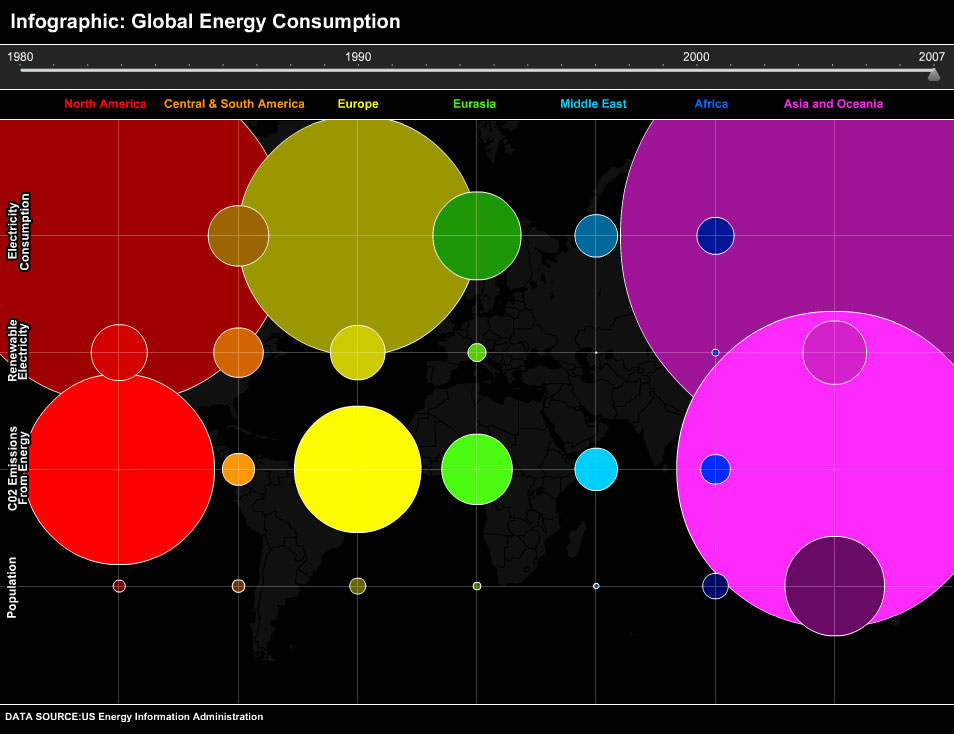
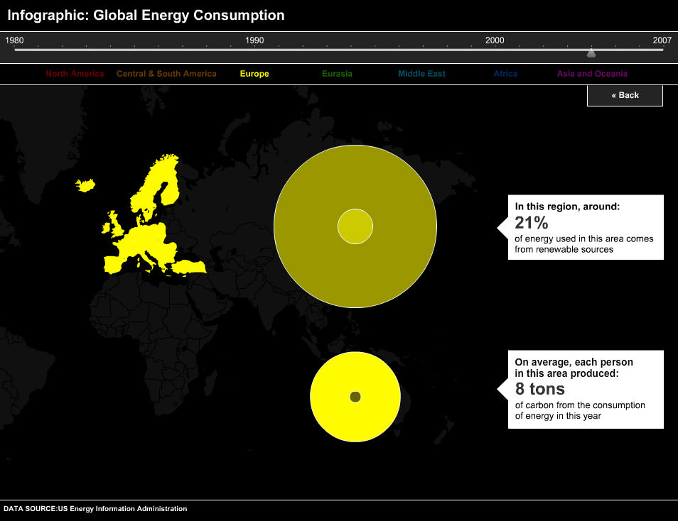
Carbon footprint of the world's biggest cities
CNN - October 2011
Created from data gathered by journalists at CNN, this is my second attempt at using circles to represent data on a world map - but my first attempt at doing it outside of flash.
The main challenge in making this using JS and CSS was that although you can make a DIV element look circular, they are still actually a square - so mouse interaction had to be intercepted and recalculated so that you could hover over the correct circle when they overlap.
Sorry, you need a bigger screen to play with this interactive.